While many businesses are relying on digital marketing alone, most estate agents are aware of the value of also using attractive print media to market their business and ultimately sell properties. Just like a website, the branding used in a estate agency brochure can make the difference between a client contacting you or not and as such, your branding needs to stand out.
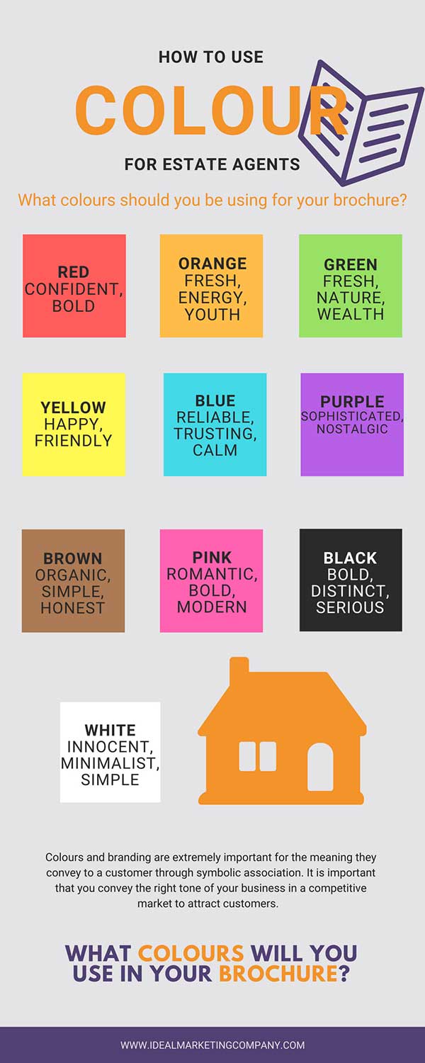
Colours are really important to the branding of any company. The ‘personality’ of an estate agency can be conveyed through a choice of colours by invoking feelings and emotions. In a practical sense, colours can also help increase a brand’s recognition by up to 80% (according to Coloursense).

Red
Red, while symbolising danger or passion, the right shade can also convey a feeling of confidence. It is also visually very bold.
Orange
Like the fruit, orange is a fresh, energetic colour that conveys a feeling of health and youth. A mix of red and yellow tones down the boldness of red, but inspires a feeling of activity.
Yellow
Sunshine yellow is known to be psychologically the happiest colour of the rainbow. A cheerful, friendly colour, it also is the most visible from a distance. However, it is this trait that also makes it a cautionary colour for yellow jackets or crime tape. Again, the right shade can evoke a good, happy feeling which will then be associated with a brand.
Green
The primary association with green is the environment. Think spritely outdoor nature, trees, and grass. It is also associated with money and wealth; like the dollar bill; green is ‘the colour of money’.
Blue
Blue is easily the most liked colour, conveying reliability, trust, authority but also like the sea and the sky, evoking a calm or harmonious feeling.
Purple
Traditionally the colour of royalty, purple communicates a sophistication in the right shade, but can also inspire nostalgia and mystery.
Brown
As an organic colour from nature, brown is associated with simplicity and honesty.
Pink
Traditionally a feminine colour, pink is now a modern colour that stirs sentimentality and romance, whilst in darker, brighter shades it stands out boldly.
Black
Bold, distinctive and serious, black reminds us of business suits and luxury.
White
Opposing black completely, white stands for innocence, minimalism and simplicity without distraction.
What ‘personality’ does your estate agency brand have?
Considering the way colours create feelings, it is important to consider what you want your brand to say about your estate agency when designing a brochure. Secondly, brochures for estate agents can be filled with photos of the houses they are trying to sell, therefore it is important not to overwhelm the brochure with too many colours in the branding, while still making sure that your brand stands out and gives the right impression. Ideally, stick to a palette of two colours and at a maximum, three.
Choosing your estate agency’s branding
It is important to consider where your brand of estate agent stands in the market when choosing colours. Are you targeting a youthful demographic or a more mature one? Are you selling luxury properties or starter homes? And as a result, do you want classic or modern, serious or fun branding?
Estate agents that aim to target high-end properties might want to brand themselves in sophisticated colours such as purple or black. In comparison, an estate agency selling properties to first time buyers might want to use lively, fresh colours such as orange, green or white.
Advice on branding your business
If you would like advice on branding your business or brochure designs, contact a member of our team today and we’ll be happy to help. Call us on 01858 374 170 or email info@idealmarketingcompany.com


